CREATIVE DIRECTION
Since graduating college in 2019, I’ve had the incredible opportunity to grow my career at Seattle Children’s Theatre—starting as a Junior Designer and working my way up to Creative Director, a role I’ve proudly held for the past two years.
Seattle Children’s Theatre is nationally respected for pushing the boundaries of what youth theatre can be—tackling complex themes, developing original plays, and fostering a lifelong appreciation for the arts.
I grew up attending shows at Seattle Children’s Theatre, and what always stuck with me was how each performance felt like stepping through a portal into another world—something only live theatre can truly achieve. A friend once shared a memory that perfectly captures this magic: they recalled seeing The Neverending Story at SCT and being completely awed by a giant, flying dragon. Years later, they looked back at photos and realized that the "dragon" they remembered was actually a man in a beautifully made costume—clearly a man in a costume, yet so real in the moment. That’s what children’s theatre does best—it blends silliness and wonder in a way that lingers for a lifetime.
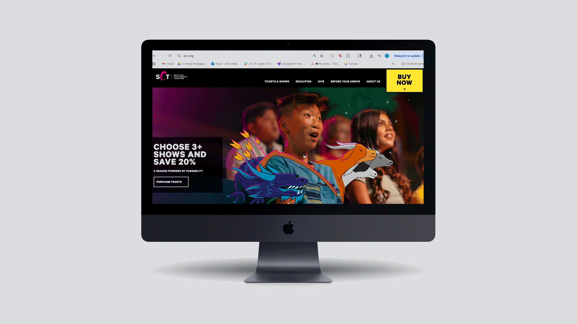
As Creative Director, my focus has been on amplifying that sense of wonder through thoughtful design and storytelling. I led a full rebrand of SCT (pictured below), developed a new illustration style, art directed photoshoots, and blended photography with illustration to create key art that deepens the connection between story and audience. This work really came together in out 2025 season launch image featuring illustrations from the show art (pictured above) and our “Find Your Story” campaign (pictured below)
Because SCT is a non-profit, I serve as both the Creative Director and the sole designer on the team. That means I wear many hats—handling everything from video editing and illustration to email marketing, social media graphics, animation, and print design.
Thanks for taking a look—I hope you enjoy the work!
During SCT’s 50th Season, we began a rebrand in collaboration with Betti Fujikado and Designer/Creative Director Arlene Mitsui. Arlene and I worked closely together on the initial concepts, and I later carried the work through to completion—refining the system and rolling it out across the entire organization.
For me, the heart of this rebrand was about transforming SCT’s visual identity from something rigid and blocky into something more organic, whimsical, and truly reflective of the spirit of children’s theatre.
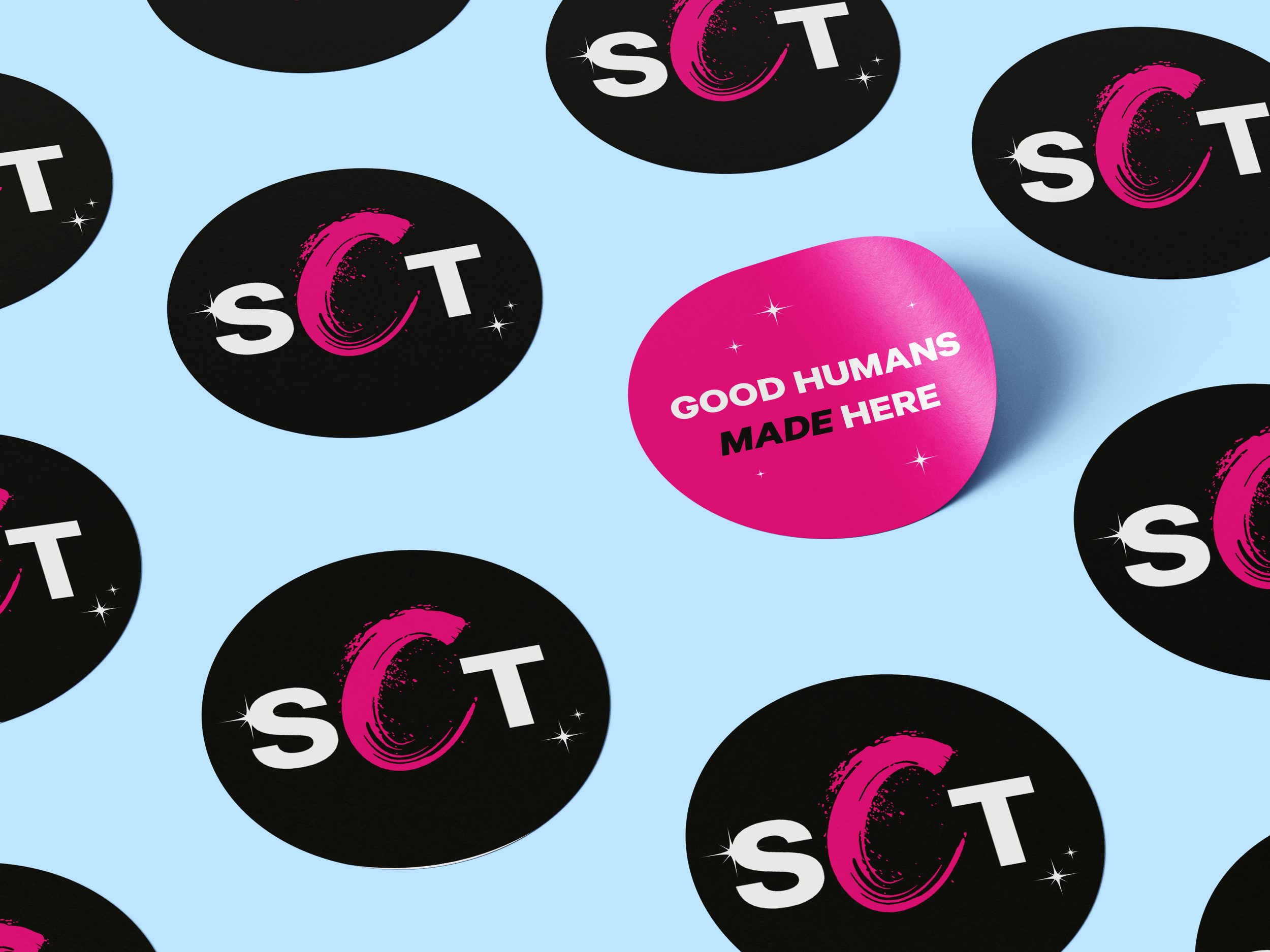
We introduced star motifs as a symbol of the magic and inspiration that both kids and adults experience when encountering live theatre for the first time. We also evolved the color palette—from a saturated, comic-book-style rainbow to a more refined set of blues and magentas. This shift helped elevate our core colors (pink, white, black, and yellow) while creating a more cohesive, mission-aligned look and feel.
This year, for the first time in a long time, every piece of design—from marketing to education materials—has felt unified, intentional, and deeply connected to SCT’s mission.
Below are some highlights from the rebrand.
OUR REBRAND

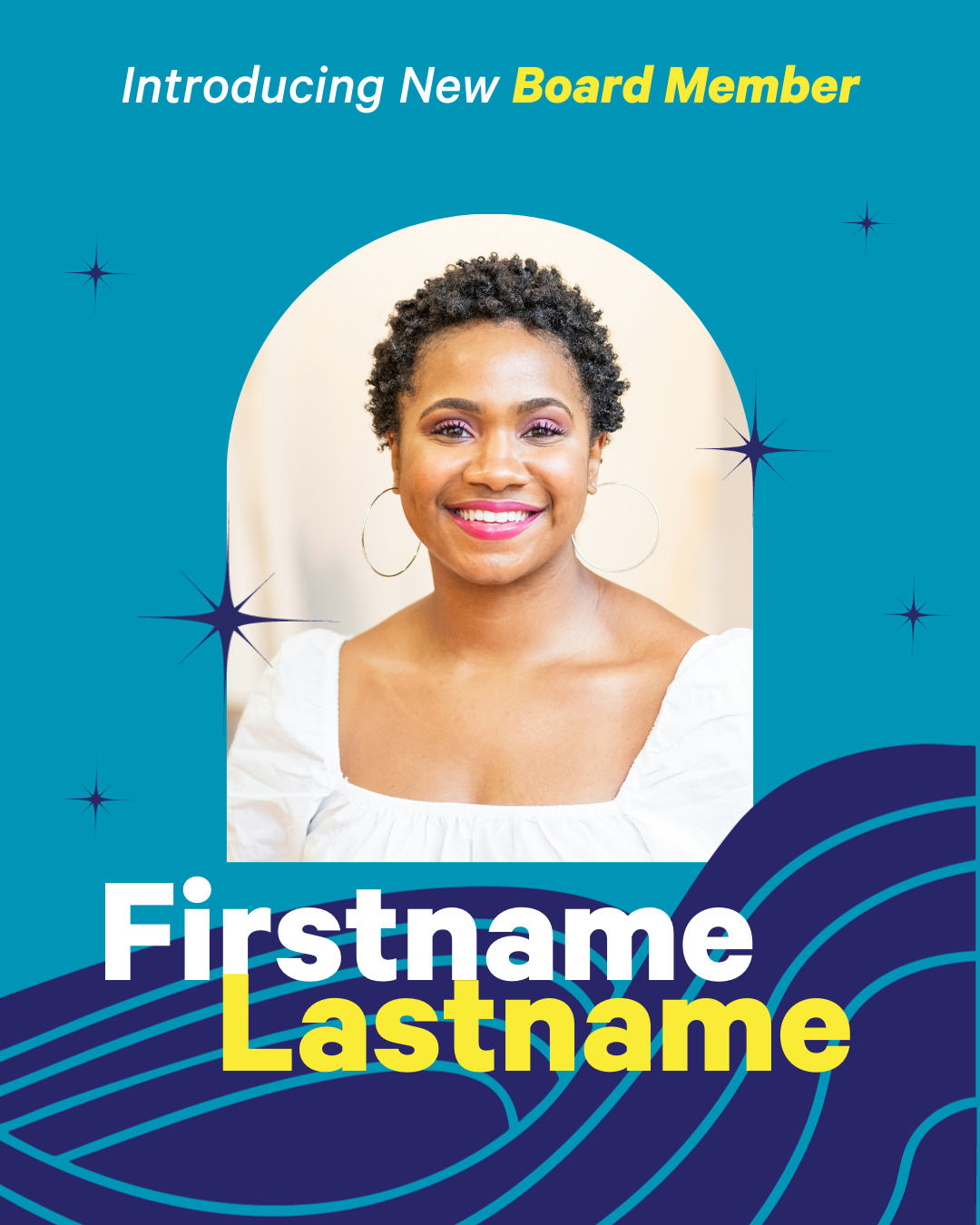
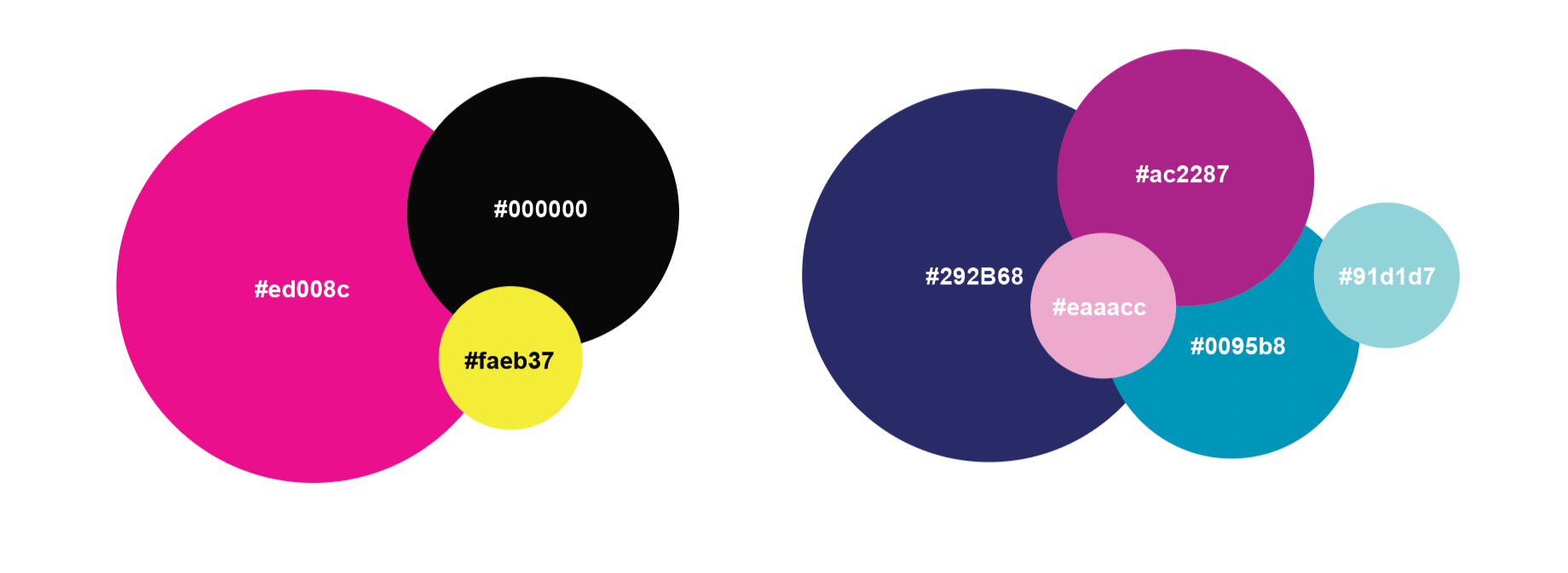
Updated Colors
Standardised Templates


Custom background illustrations based on lobby metal work
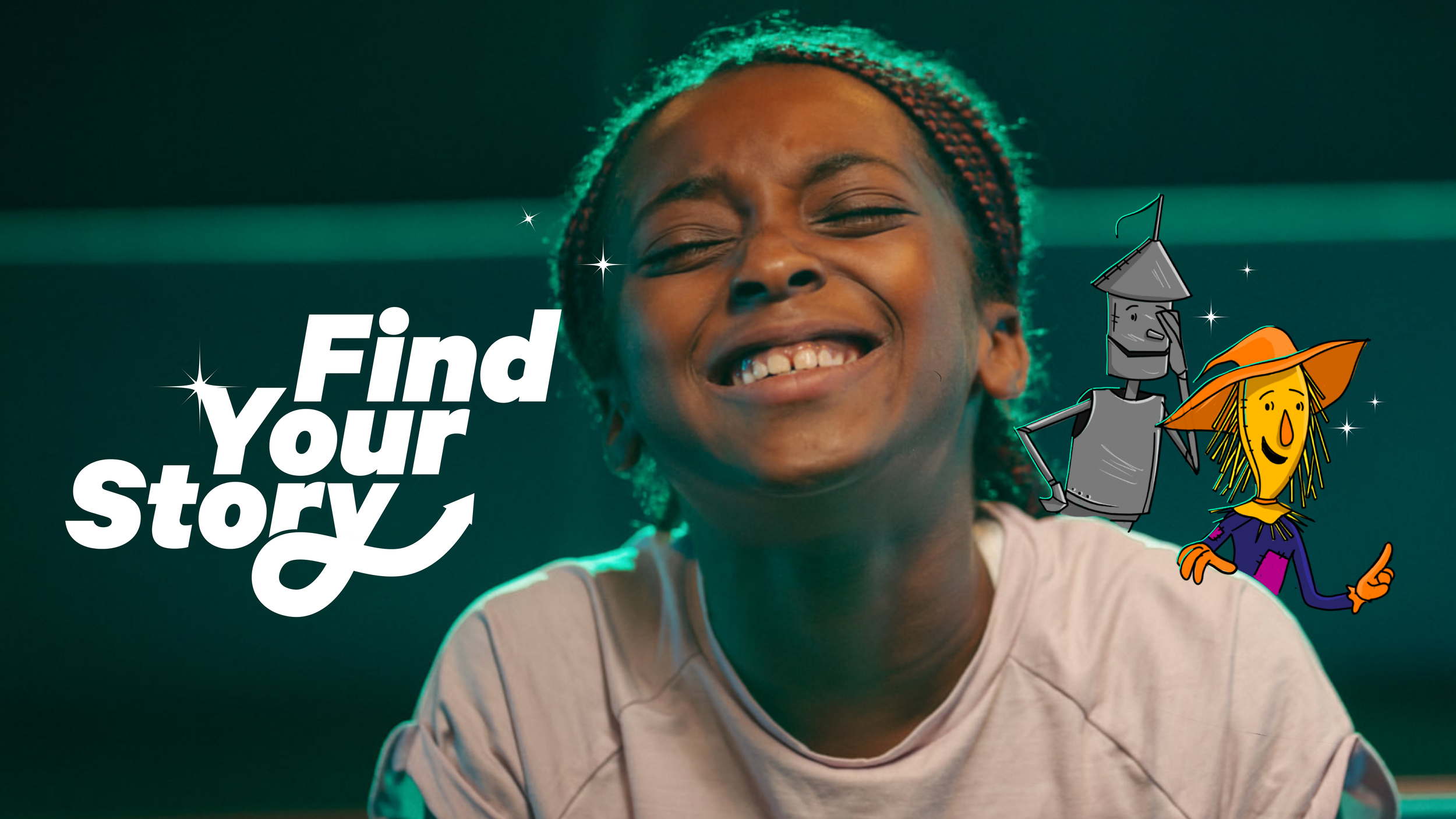
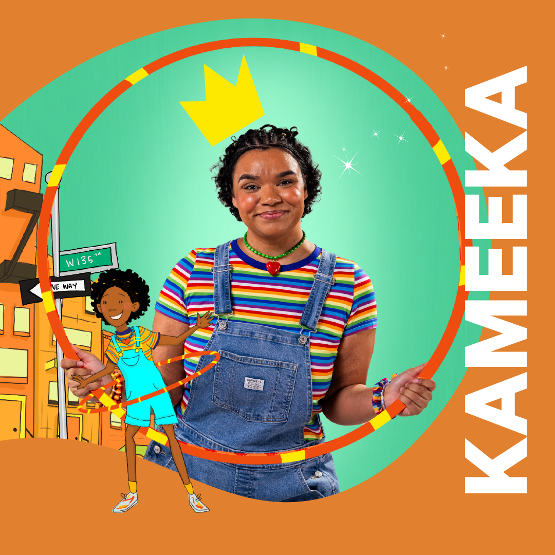
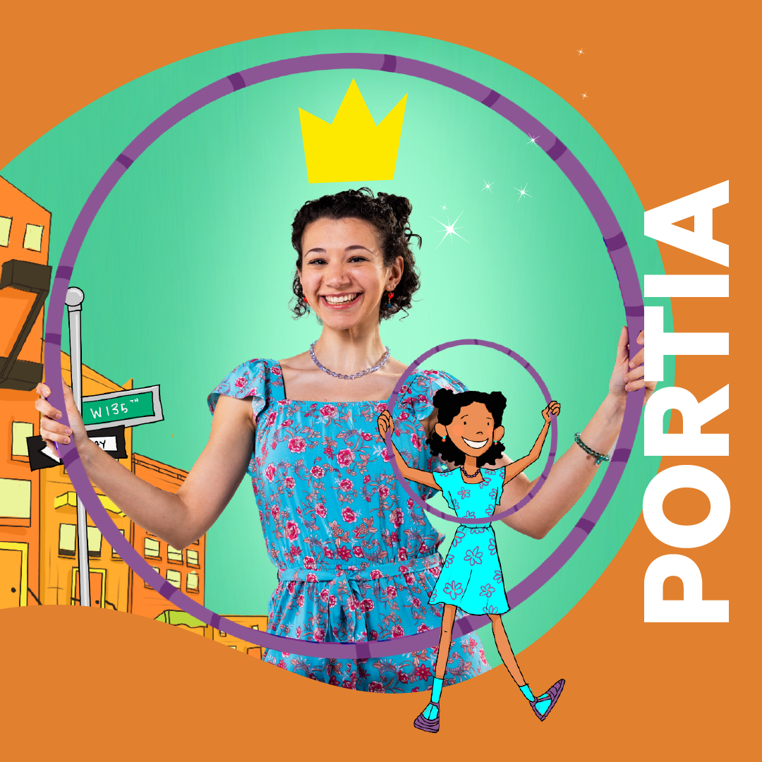
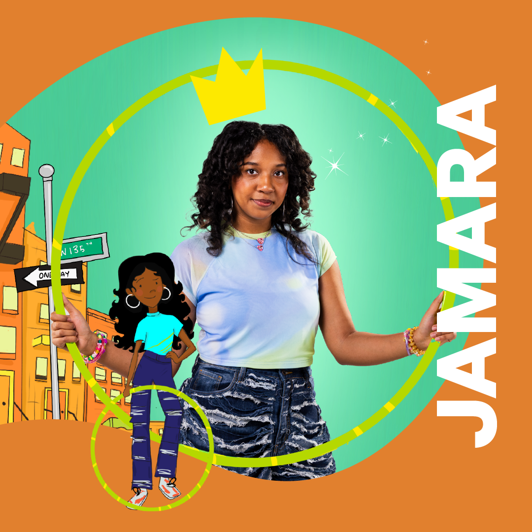
FIND YOUR STORY
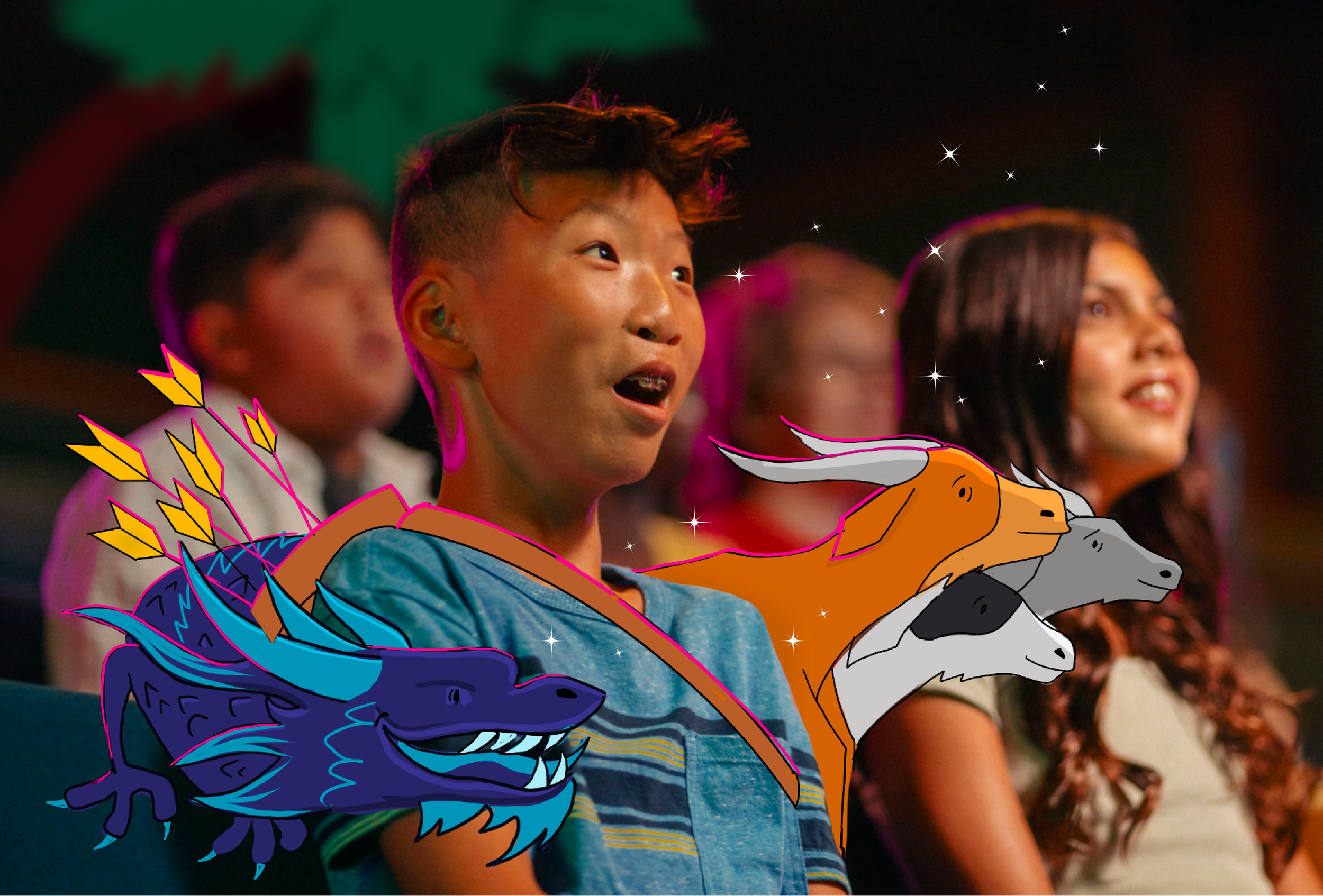
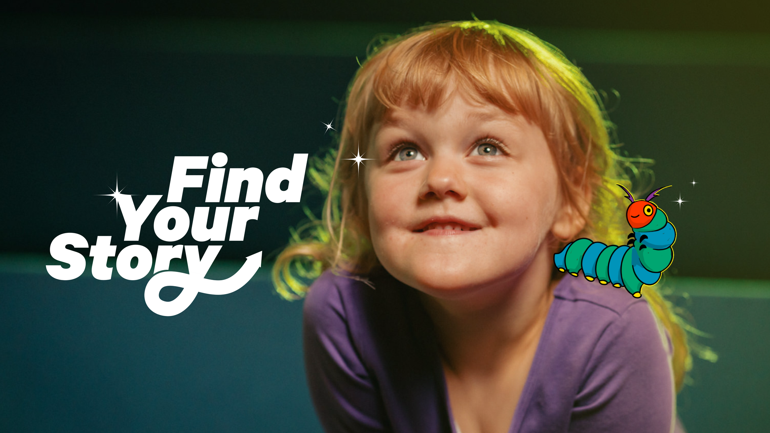
As part of an organization-wide effort to strengthen our brand and connect more deeply with our audience, I created "Find Your Story"—an awareness campaign for Seattle Children’s Theatre that highlights the immersive power of live theatre and its potential to inspire personal connection.
At SCT, we often see young audiences that connect deeply with the performances they experience. It’s not uncommon for children to meet the actors after a show and fully believe they’ve met the characters themselves. That sense of magic and connection is at the heart of what we do.
For our older youth audiences, representation becomes just as important as imagination. Through inclusive, thoughtfully cast productions, we aim to ensure that every young person who walks through our doors can see a reflection of themselves on stage—whether in identity, experience, or spirit.
The "Find Your Story" campaign is built around that idea. By blending animated characters from our beloved shows and real kids in the audience we express that connection between the the real and imagined world that live theatre exists in.
PHOTOS BY JORDAN NICHOLSON

SEASON ART
2025 marks my fourth season illustrating the key art for Seattle Children’s Theatre, and this year’s collection is my favorite yet.
This season featured productions that skewed older than previous years, which gave me the opportunity to evolve both the characters and the overall tone of the illustrations—especially for shows like Robin Hood and Young Dragon. I adjusted the mood, composition, and character design to better reflect the emotional complexity and adventurous spirit of these stories, while still maintaining the sense of wonder that defines SCT.
One of the most exciting aspects of working at SCT has always been the creative freedom to develop a distinct illustration style specifically for the organization. Each designer before me brought their own unique visual language to the season artwork, and continuing that legacy has been both a joy and a creative challenge.
SCT produces professional theatre for young audiences, but it’s not just for kids—our shows are crafted to resonate with audiences of all ages. That broader audience perspective has deeply influenced the illustration style I’ve developed. I wanted the art to feel accessible to children, teens, and adults alike—playful but not childish, magical but emotionally grounded.
If the art were aimed solely at very young children (ages 3–5), I might lean into bold, blocky shapes and exaggerated proportions. On the other hand, for a teen-only audience, I’d likely focus on moodier palettes, detailed textures, and subtler emotional cues. For SCT, the sweet spot lives somewhere in between.
In crafting this style, I drew inspiration from visual storytelling that appeals across age groups—like book series such as Percy Jackson, and most notably, Studio Ghibli. Ghibli’s work masterfully balances expressive characters and immersive environments—zoomed in enough to capture emotion, and zoomed out enough to reveal a full world of imagination and detail. That balance has been my guiding light as I continue to shape SCT’s visual identity through illustration.
As always, my goal is to create artwork that reflects the magic, emotion, and whimsy that live at the heart of children's theatre.
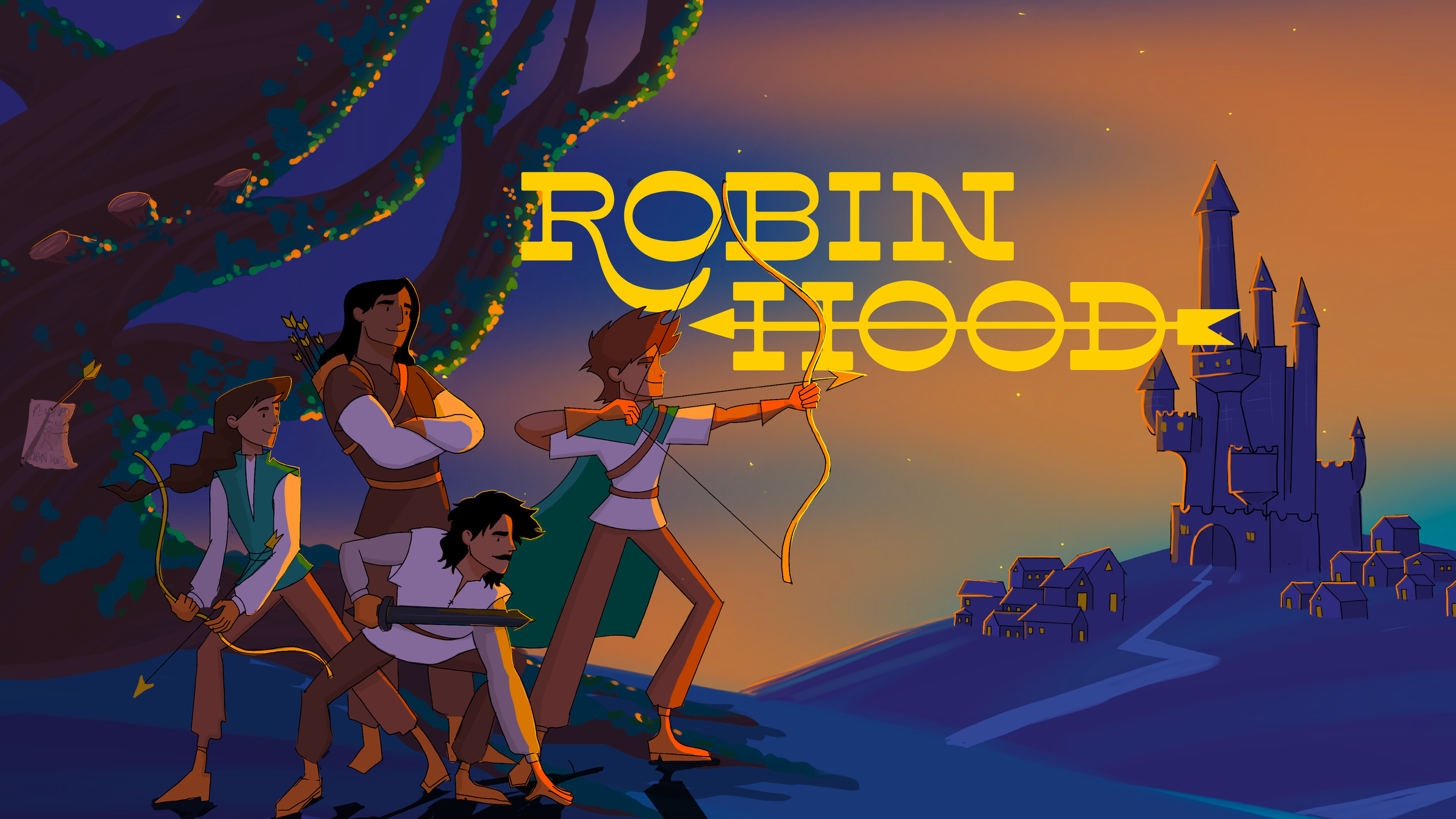
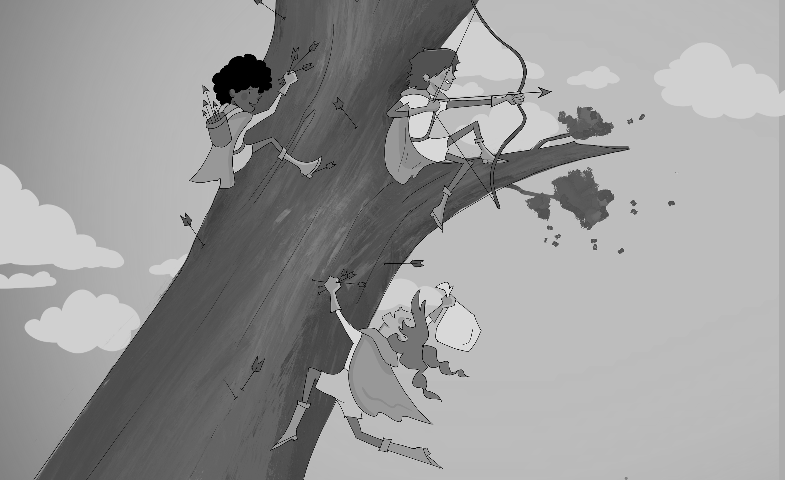
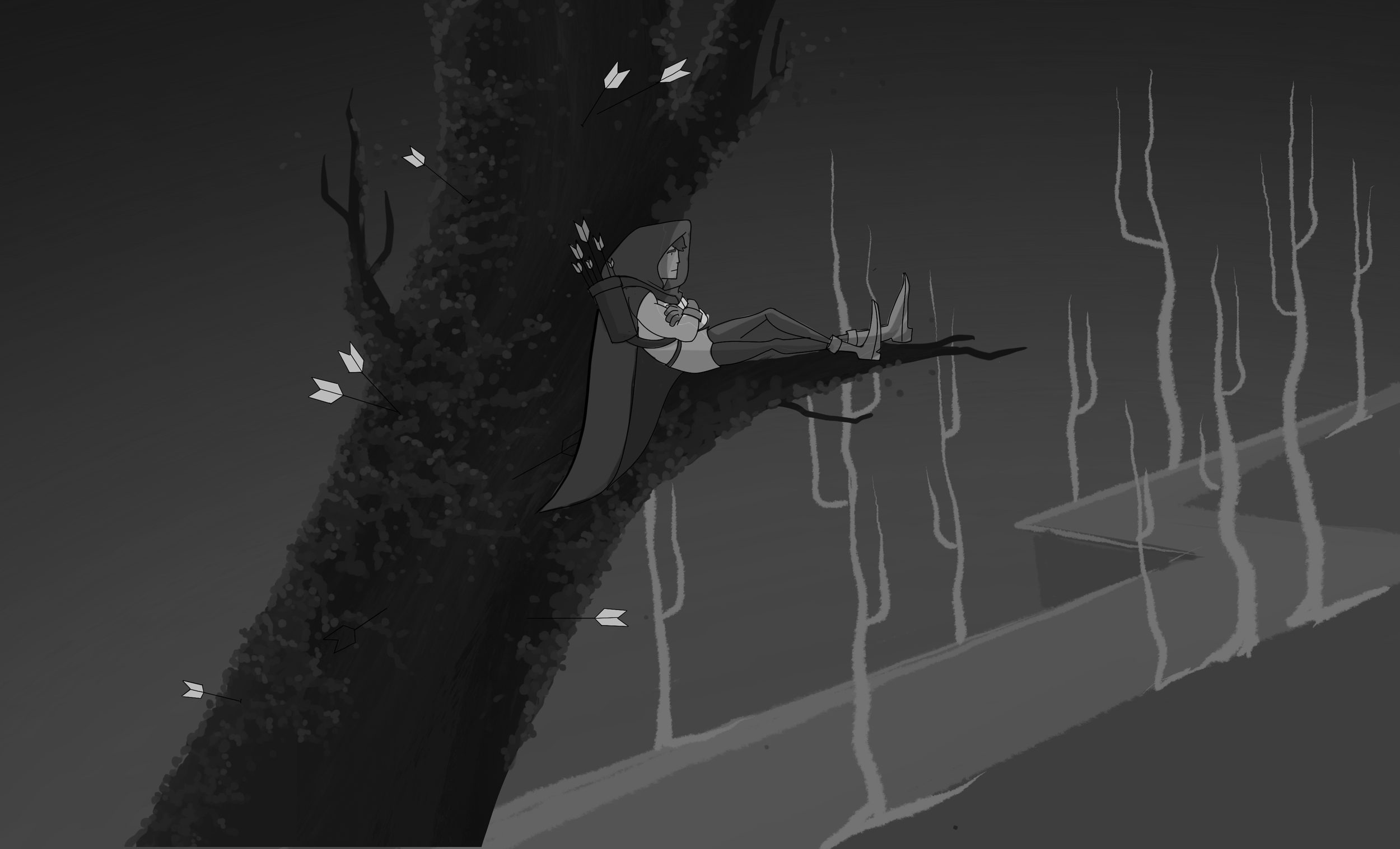
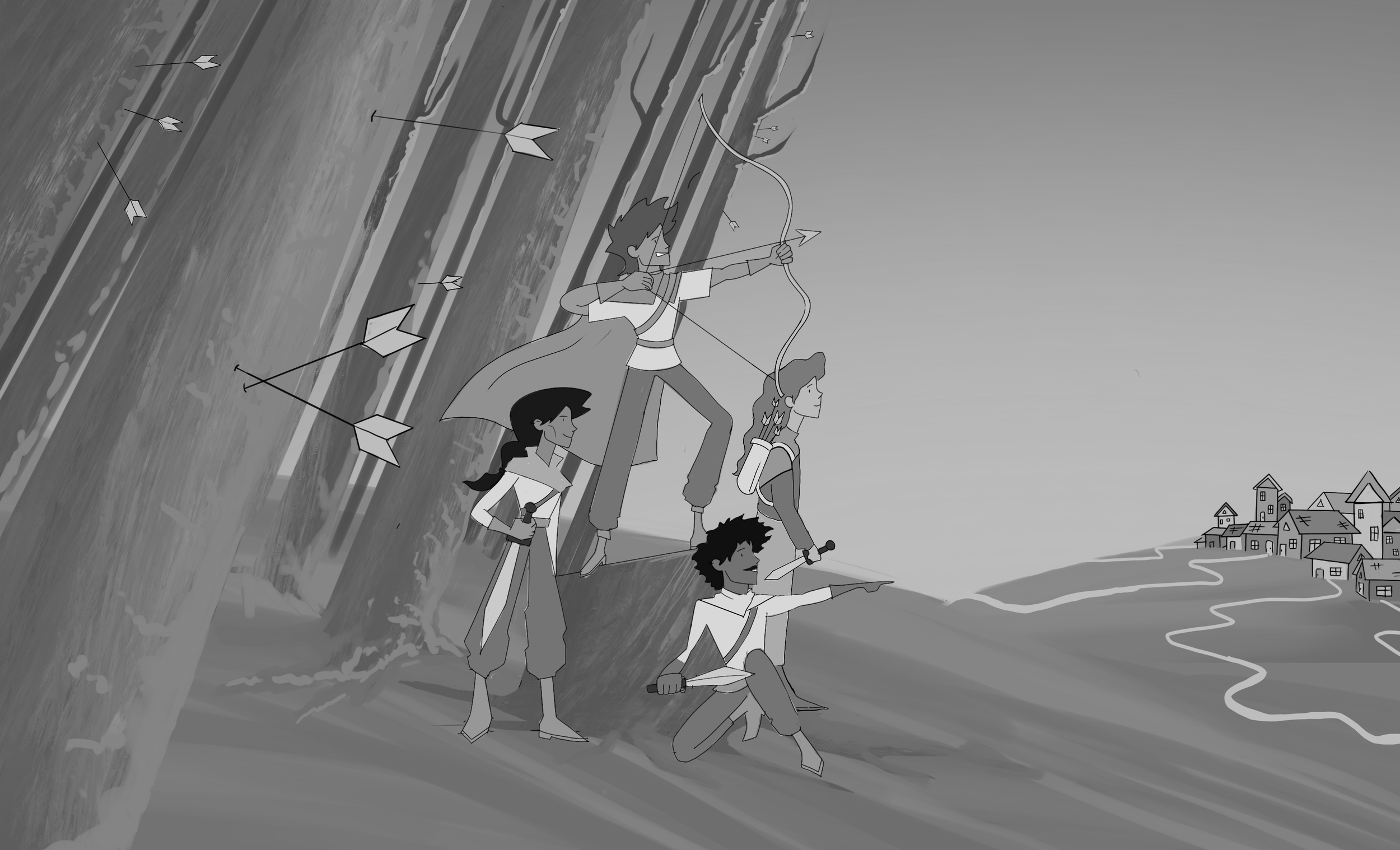
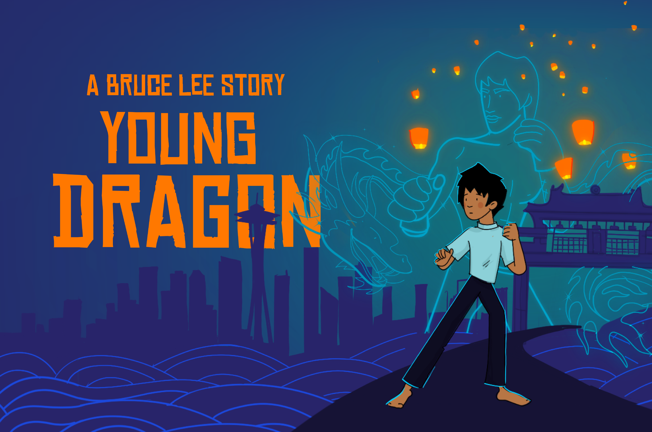
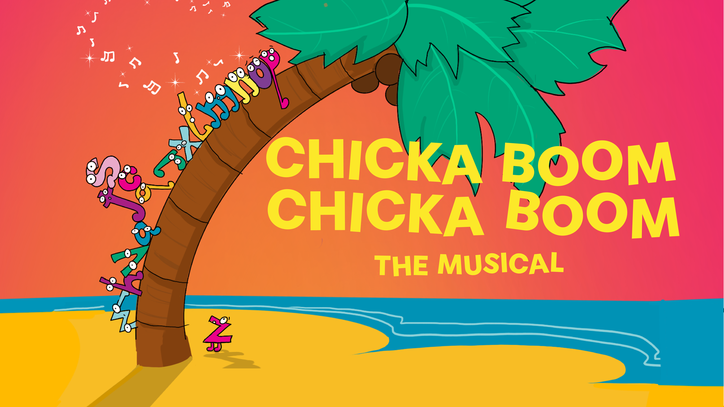
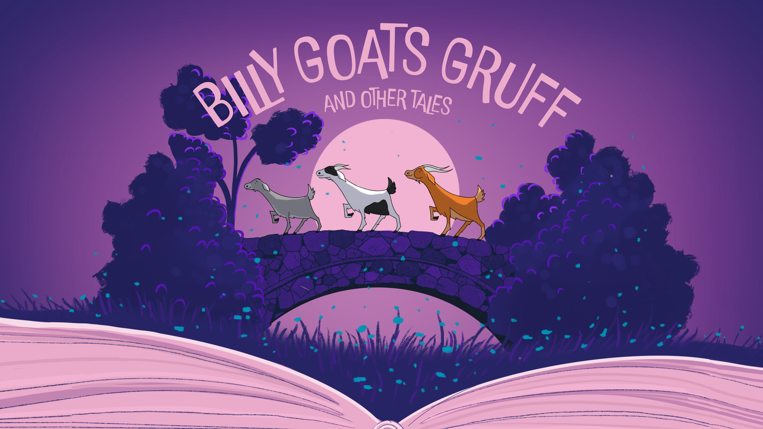
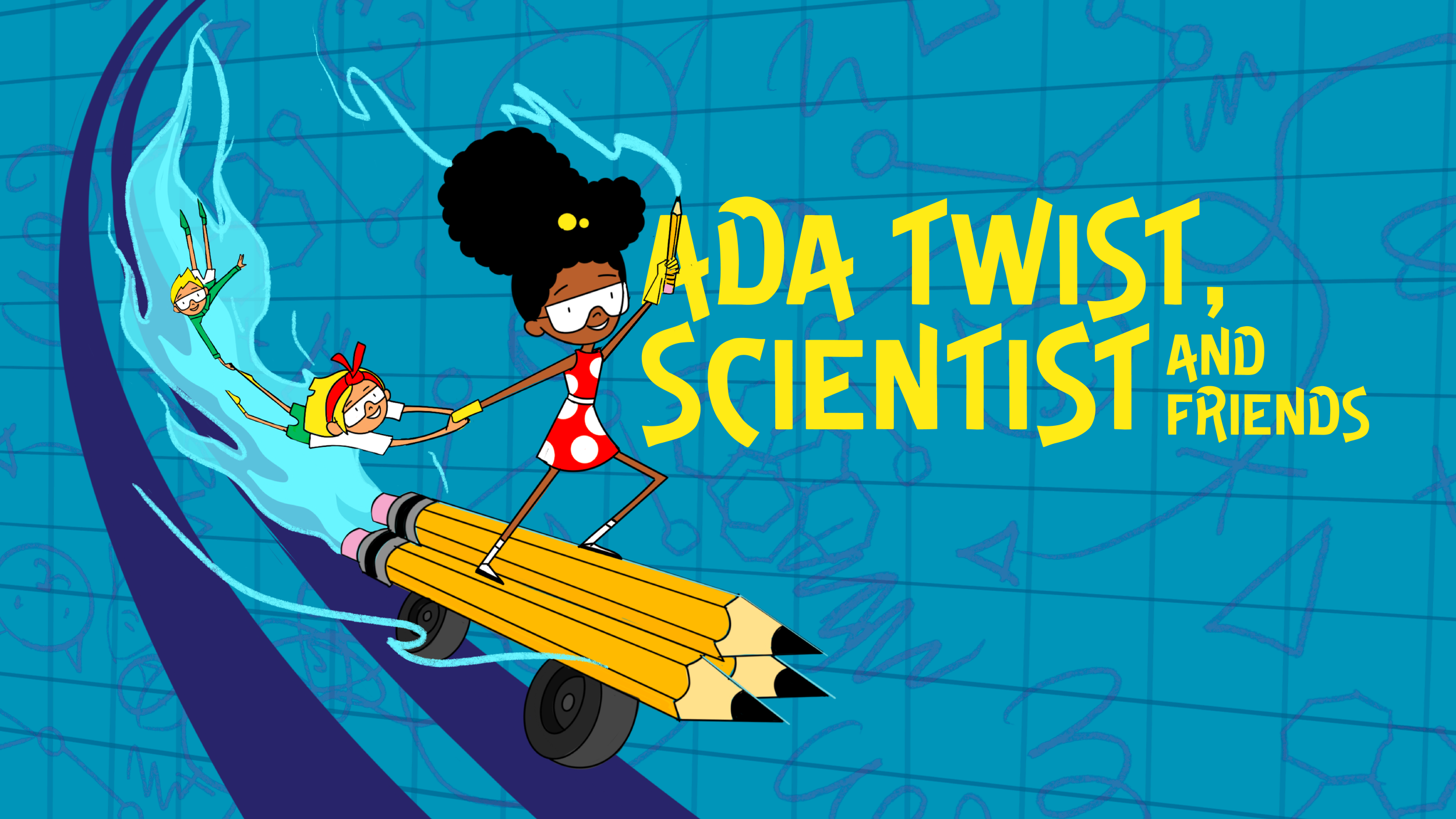
PHOTO ART DIRECTION
In 2024, Seattle Children’s Theatre began transitioning from fully illustrated show art to photography-based promotional materials in the final weeks leading up to opening night. This shift allowed us to showcase our performers and costumes more directly, while still keeping a visual connection to our brand's illustration-forward identity.
Because our show design teams typically begin their contracts about two months before opening, we schedule photoshoots as soon as costumes are show-ready—often just in time to meet our advertising deadlines.
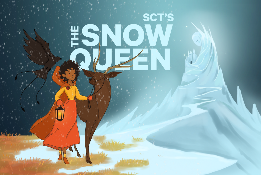
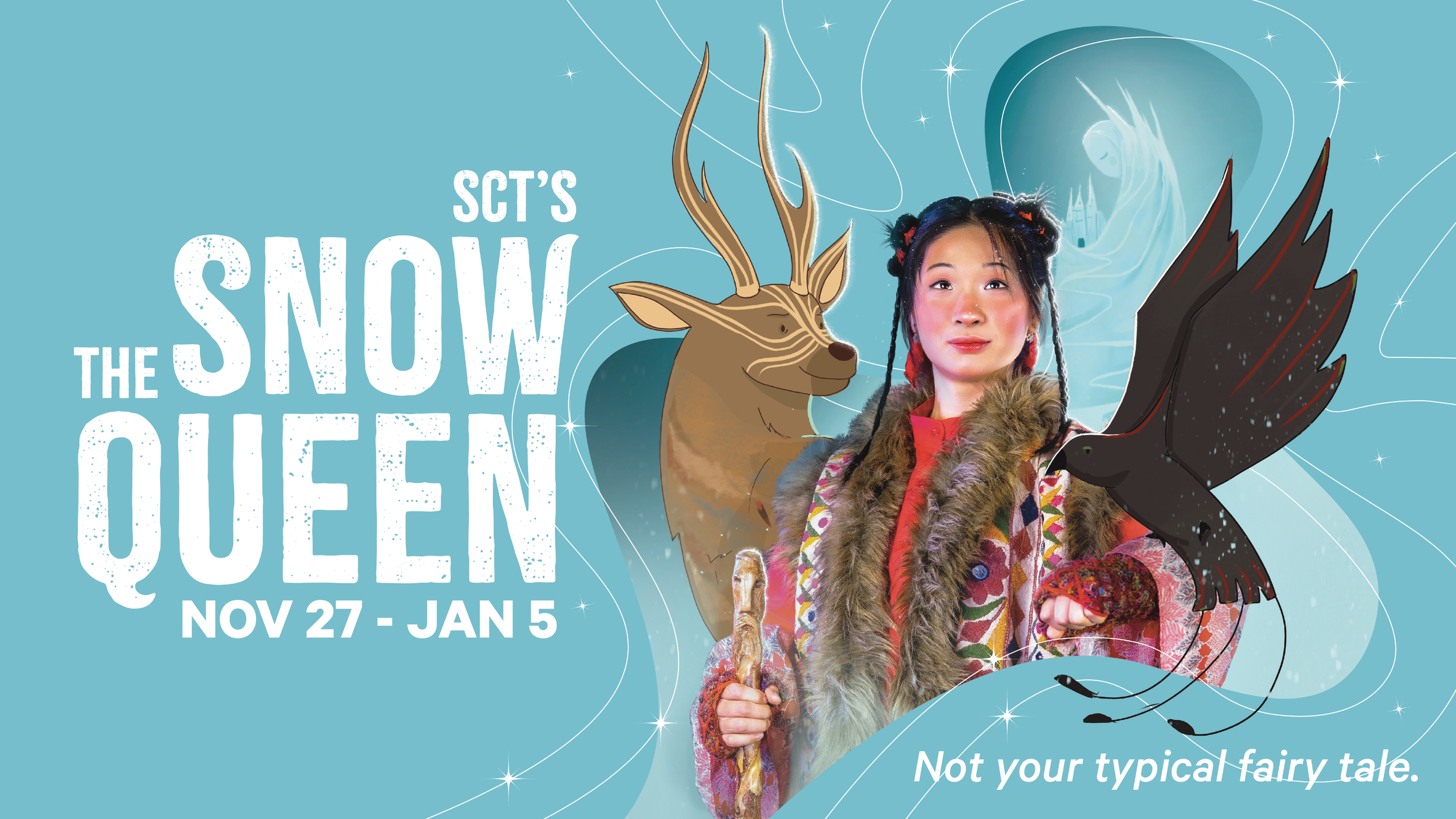
Oroginal Snow Queen Illustration
Snow Queen Photoshoot
Our first photoshoot of the season was for The Snow Queen. This was my first time creative directing a photoshoot and producing this type of asset from start to finish. We had only two weeks to concept, execute, and deliver final materials for marketing.
To maintain visual continuity with our illustrated show art, I decided to blend a portrait of the lead actress with illustrated elements from our existing brand assets. The idea was to create a stylistic bridge between the hand-drawn magic of our illustrations and the real-world energy of live performance.
Due to timing, we didn’t have the ideal backdrop color available on shoot day. This meant I had to do extensive photo editing and compositing—far more than I’d ever done before—to remove the background, adjust lighting, and integrate the photo with the illustrated design. The photographer was fantastic, and despite the last-minute hustle, I’m incredibly proud of how magical and cohesive the final piece turned out.
PHOTOS BY GIAO NGUYEN
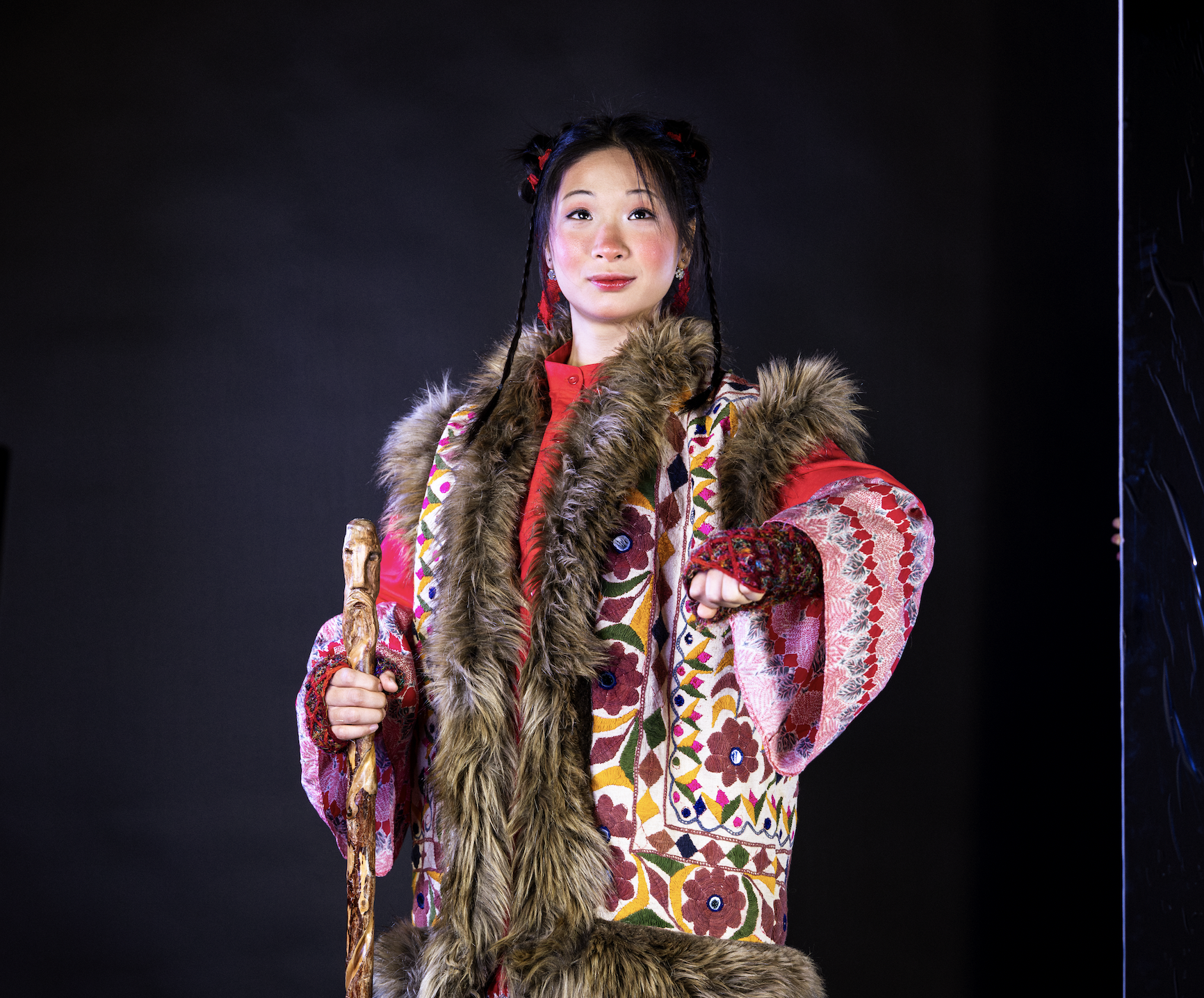
Original Photoshoot Photo
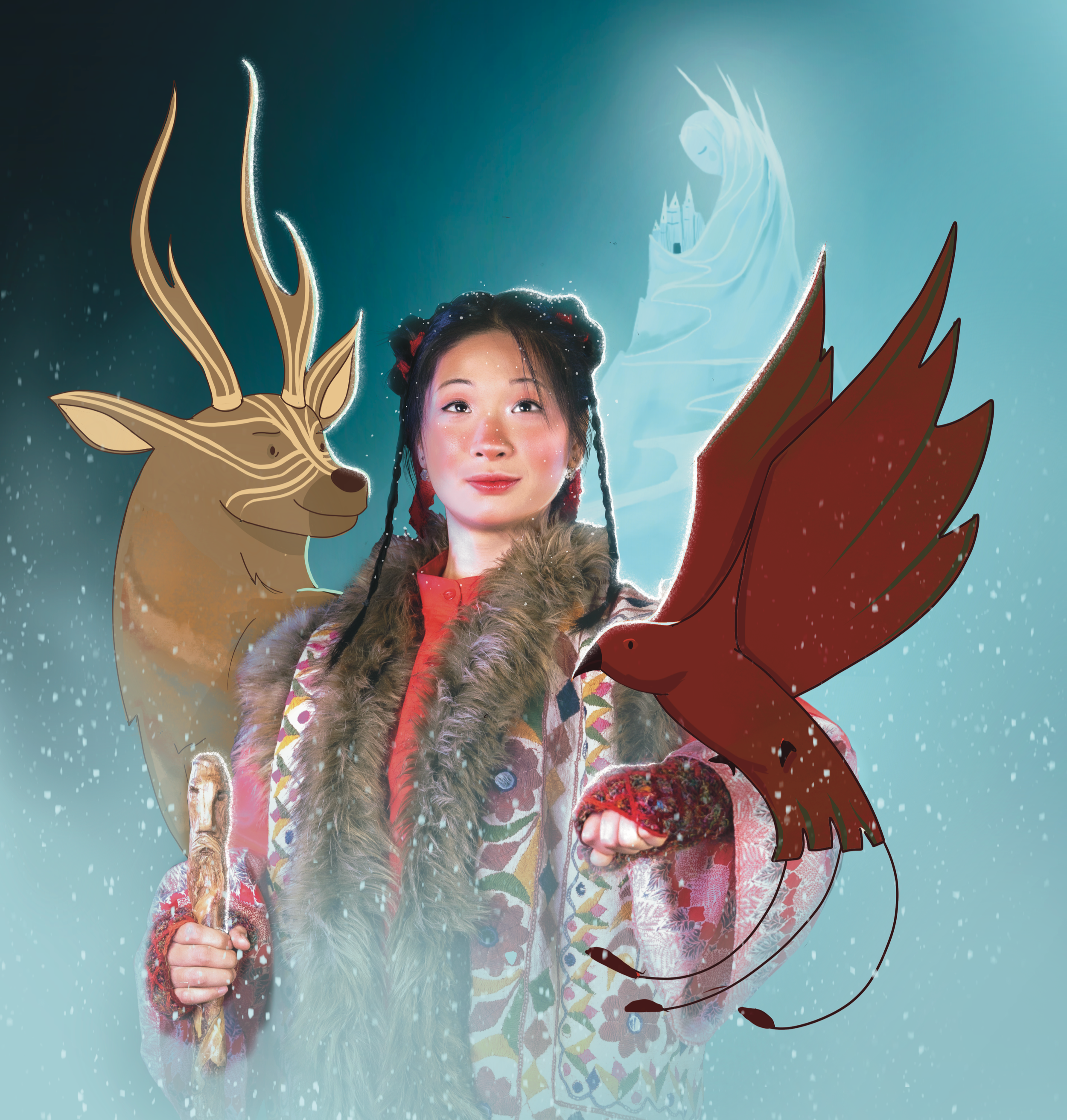
Edited Photo Shoot Photo
Final Design
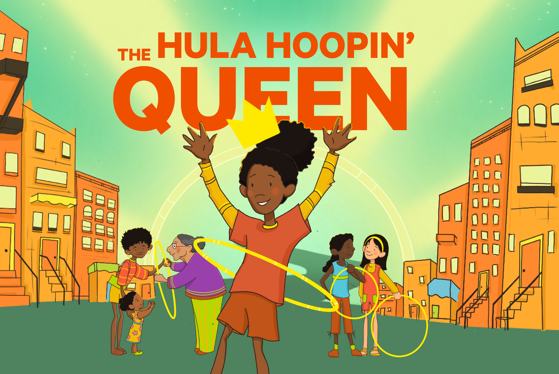
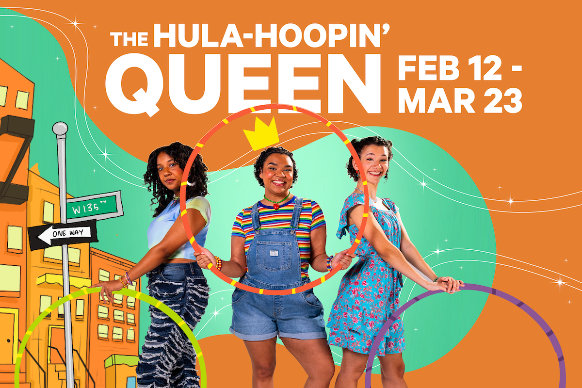
Original Hula-Hoopin’ Queen Illustration
Hula-Hoopin’ Queen Photoshoot
Our second shoot, for The Hula-Hoopin’ Queen, had a bit more breathing room. We were able to source the correct backdrop color in advance, and our photographer came prepared with extra lighting gear, allowing for more dynamic and playful setups.
We spent a couple of hours capturing both group and solo poses, drawing inspiration from the original book cover (photo 1), as well as creating fun, candid-style “best friend” shots. We blasted The Cheetah Girls soundtrack during the shoot, which made for a joyful and energized atmosphere that came through in the photos.
This shoot was not only smoother from a production standpoint, but also a total blast creatively. I absolutely love how the final images capture the spirit of the show—bright, bold, and full of personality.
PHOTOS BY GIAO NGUYEN
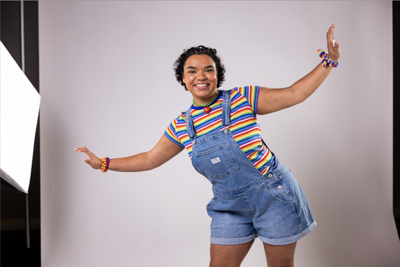

Original Photoshoot Photos

Final Designs
Individual Actor Illustrations for Social
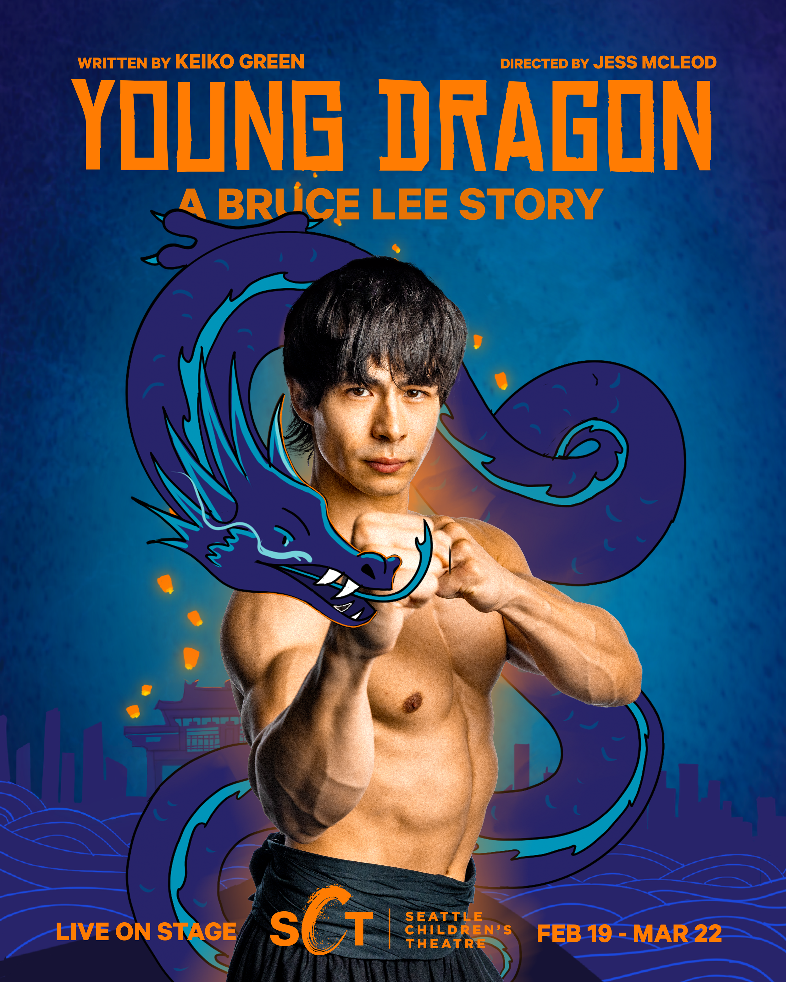
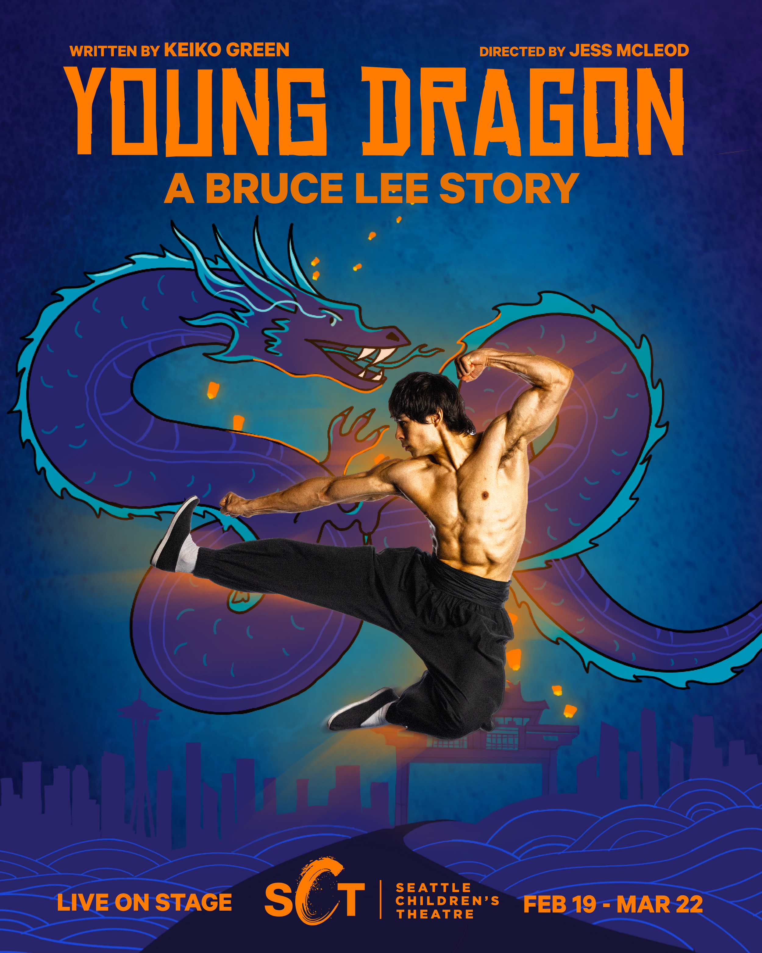
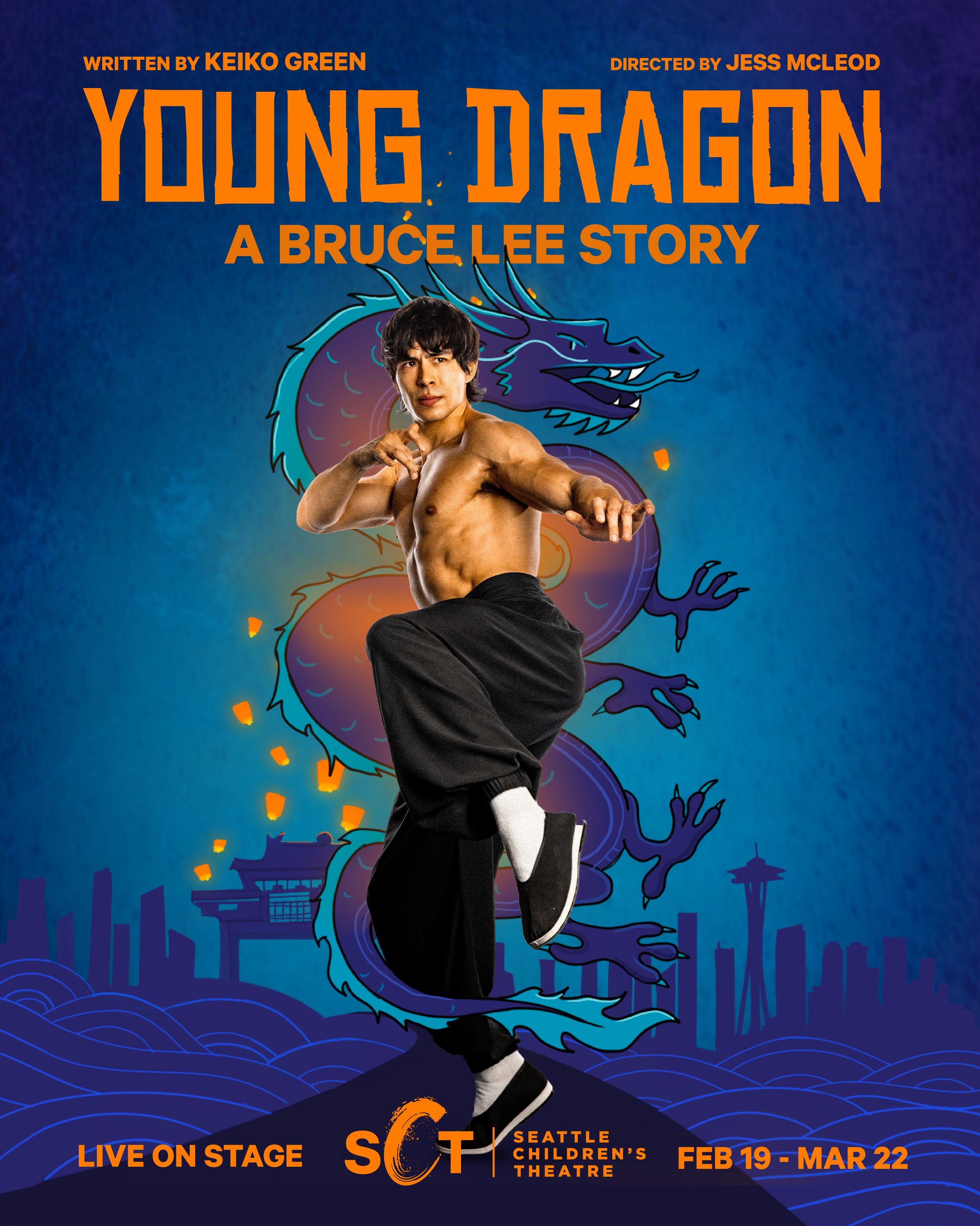
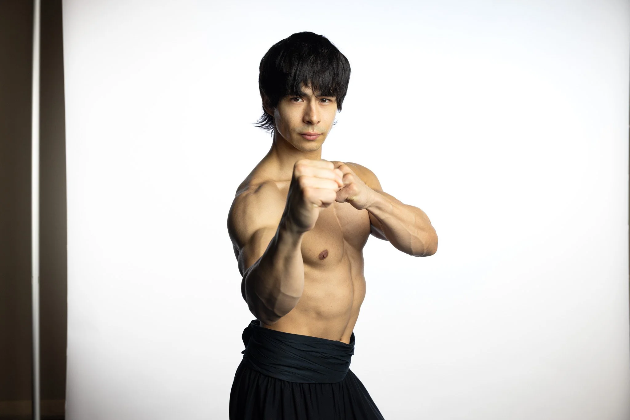
Original Young Dragon Illustration
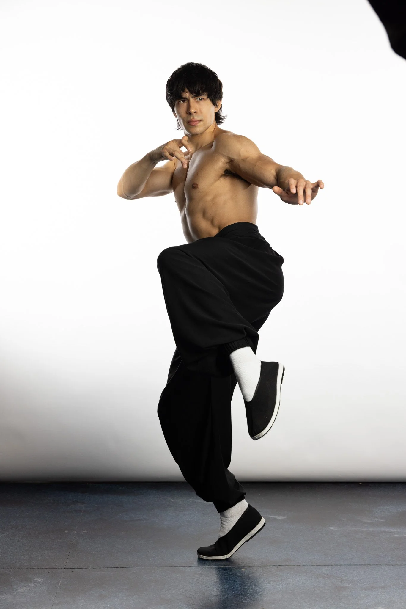
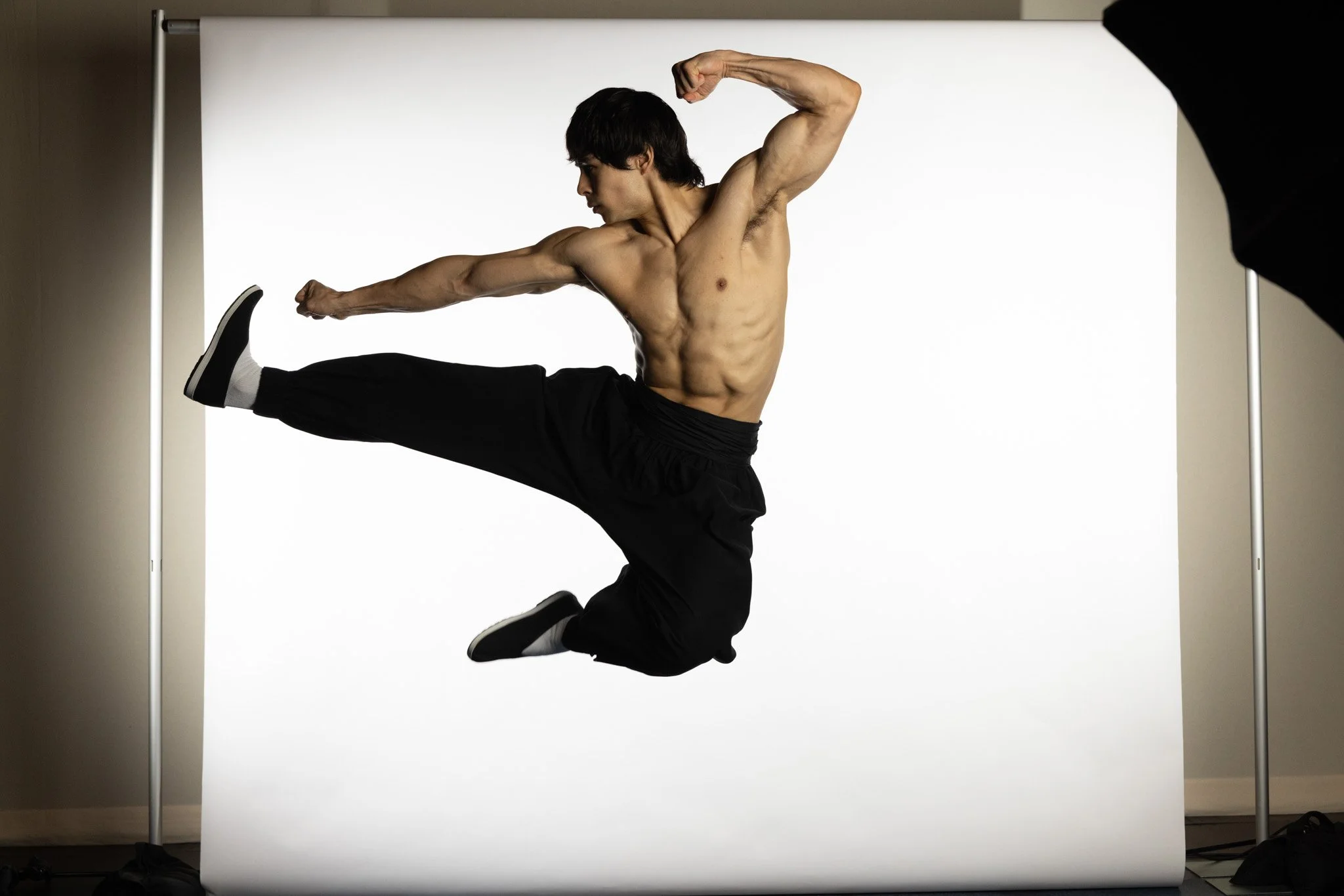
Young Dragon Photoshoot
Young Dragon: A Bruce Lee Story was one of our most involved productions of the year. Not only did we get to work with the Bruce Lee Foundation, but this production was originally supposed to go to the Kennedy Center, where it did not end up going. Because of this decision, this show had a massive amount of attention on it comparative to the other shows in our season.
This show is also a show for 8+, aimed at tween boys which is older and different than most of our shows in our last few seasons. Because of that, not only did the designs need extra attention but they also needed to look “cool”.
For that reason I opted for classic Bruce Lee poses with illustration integrated in, to still have the art in our SCT style, but with more focus on Bruce Lee movie poster styling than the original illustration had.
PHOTOS BY GIAO NGUYEN
Original Photoshoot Photo